
| 일 | 월 | 화 | 수 | 목 | 금 | 토 |
|---|---|---|---|---|---|---|
| 1 | 2 | 3 | 4 | |||
| 5 | 6 | 7 | 8 | 9 | 10 | 11 |
| 12 | 13 | 14 | 15 | 16 | 17 | 18 |
| 19 | 20 | 21 | 22 | 23 | 24 | 25 |
| 26 | 27 | 28 | 29 | 30 | 31 |
- GitHub
- Gradle
- Kotlin
- relay
- boj
- 암호학
- 백준
- Rxjava
- textfield
- MiTweet
- NGINX
- androidStudio
- Compose
- Coroutine
- 쿠링
- MyVoca
- Python
- architecture
- pandas
- android
- 코드포스
- 코루틴
- ProGuard
- livedata
- Coroutines
- 프로그래머스
- AWS
- TEST
- Hilt
- Codeforces
- Today
- Total
이동식 저장소
Compose TextField를 커스터마이징해 보자 본문
Compose에는 여러 타입의 Material ``TextField``가 선언되어 있다.

하지만 머티리얼 디자인과는 다른 커스텀 ``TextField``가 필요하다면? ``BasicTextField``를 커스터마이즈하면 된다.
BasicTextField
``BasicTextField``는 모든 머티리얼 ``TextField``의 backbone 컴포넌트이다. 실제로 ``OutlinedTextField`` 등의 코드를 보면, 내부적으로 ``BasicTextField``를 호출하고 있다.
@Composable
fun OutlinedTextField(
	// ...
) {
	// ...
    BasicTextField(
    	// ...
        decorationBox = @Composable { innerTextField ->
            TextFieldDefaults.OutlinedTextFieldDecorationBox(
            	// ...
            )
        }
    )
}
위 코드처럼, ``BasicTextField``의 ``decorationBox`` 매개변수를 통해 텍스트 필드의 여러 속성을 지정할 수 있다. 외곽선이 필요없다면 ``TextFieldDecorationBox``를, 외곽선이 필요하다면 ``OutlinedTextFieldDecorationBox``를 사용하면 된다.
매개변수가 매우 많으므로, 실제 적용 예시를 통해 공부해 보자.
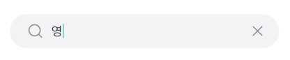
Example: 쿠링
쿠링에서는 다음과 같은 디자인을 사용하고 있다. 외곽선이 없으므로 ``TextFieldDecorationBox``를 사용하여 구현해 보자.

우선 기본 매개변수를 다음과 같이 세팅한다. ``value``는 ``TextField``에 보여줄 text, ``innerTextField``는 Compose 프레임워크가 제공하는 매개변수이다.
decorationBox = { innerTextField ->
    TextFieldDefaults.TextFieldDecorationBox(
        value = query,
        innerTextField = innerTextField,
        // TODO: 이 밑에 매개변수를 추가할 것
    )
},
이제 하나씩 매개변수를 작성해 보자.
// Boolean: TextField 활성화/비활성화
enabled = true,
// Boolean: 텍스트를 1줄로 보여줄 것인가?
singleLine = singleLine,
// 텍스트 변형
// 비밀번호, 전화번호 등을 보여줄 때에는 적절한 변형을 적용해볼 수 있다.
// 지금은 그럴 필요가 없으므로, 어떠한 변형도 적용하지 않는다.
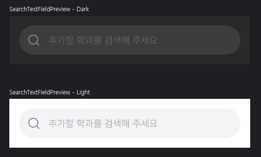
visualTransformation = VisualTransformation.None,// 텍스트가 비어 있을 때의 placeholder.
// 밑에 따로 선언함. 코드는 생략.
placeholder = {
Placeholder(placeholderText = placeholderText)
},// 텍스트 앞에 보여줄 아이콘.
// 마찬가지로 밑에 따로 선언함.
leadingIcon = {
LeadingSearchIcon()
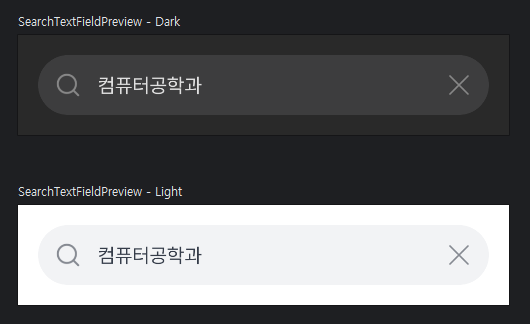
},// TextField 맨 끝에 보여줄 아이콘.
// 텍스트가 있을 때에만 모두 지우기 버튼을 보여준다.
trailingIcon = {
AnimatedVisibility(
visible = query.isNotEmpty(),
enter = fadeIn(),
exit = fadeOut(),
) {
TrailingDeleteIcon(onClear = { onQueryUpdate("") })
}
},// TextField에 적용할 색깔.
// 매개변수가 매우 많지만, 아래에서 사용한 정도만 알아둬도 충분할 듯하다.
colors = TextFieldDefaults.textFieldColors(
textColor = textColor,
backgroundColor = backgroundColor,
cursorColor = textColor,
),완성!
전체 코드는 아래를 참고.
@OptIn(ExperimentalMaterialApi::class)
@Composable
fun SearchTextField(
    query: String,
    onQueryUpdate: (String) -> Unit,
    modifier: Modifier = Modifier,
    placeholderText: String = "",
    singleLine: Boolean = true,
    keyboardOptions: KeyboardOptions = KeyboardOptions(imeAction = ImeAction.Done),
    keyboardActions: KeyboardActions = KeyboardActions(),
    interactionSource: MutableInteractionSource = remember { MutableInteractionSource() },
    contentPadding: PaddingValues = PaddingValues(all = 0.dp),
) {
    val shape = RoundedCornerShape(50)
    val backgroundColor = KuringTheme.colors.gray100
    val textColor = KuringTheme.colors.textBody

    BasicTextField(
        value = query,
        onValueChange = onQueryUpdate,
        modifier = modifier
            .clip(shape)
            .background(backgroundColor, shape = shape),
        textStyle = TextStyle(
            fontSize = 16.sp,
            lineHeight = 24.sp,
            fontFamily = Pretendard,
            fontWeight = FontWeight(400),
            color = textColor,
        ),
        decorationBox = { innerTextField ->
            TextFieldDefaults.TextFieldDecorationBox(
                value = query,
                innerTextField = innerTextField,
                enabled = true,
                singleLine = singleLine,
                visualTransformation = VisualTransformation.None,
                interactionSource = interactionSource,
                placeholder = {
                    Placeholder(placeholderText = placeholderText)
                },
                leadingIcon = {
                    LeadingSearchIcon()
                },
                trailingIcon = {
                    AnimatedVisibility(
                        visible = query.isNotEmpty(),
                        enter = fadeIn(),
                        exit = fadeOut(),
                    ) {
                        TrailingDeleteIcon(onClear = { onQueryUpdate("") })
                    }
                },
                colors = TextFieldDefaults.textFieldColors(
                    textColor = textColor,
                    backgroundColor = backgroundColor,
                    cursorColor = textColor,
                ),
                contentPadding = contentPadding
            )
        },
        singleLine = singleLine,
        keyboardOptions = keyboardOptions,
        keyboardActions = keyboardActions,
    )
}
참고자료
androidx.compose.foundation.text | Android Developers
androidx.compose.desktop.ui.tooling.preview
developer.android.com
'Primary > Compose' 카테고리의 다른 글
| Compose Strong Skip (0) | 2024.05.05 |
|---|---|
| Modifier로 블러 효과 구현하기 (0) | 2024.05.01 |
| Icon vs. Image (0) | 2024.04.07 |
| Compose에서 시스템 폰트 크기 확인하기 (0) | 2024.03.24 |
| TextField에 default string을 줘도 커서가 맨 앞으로 가는 이유 (0) | 2024.02.28 |


